Amber B Design Studio

Interior Design & Decoration for the South Florida region

  • Home
  • About
  • Services
  • Portfolio
  • Blog
  • Press
  • Contact

{Before and After Shots} More is Definitely Better

February 5, 2013 by Amber Filed Under: design, kitchen, personal design style


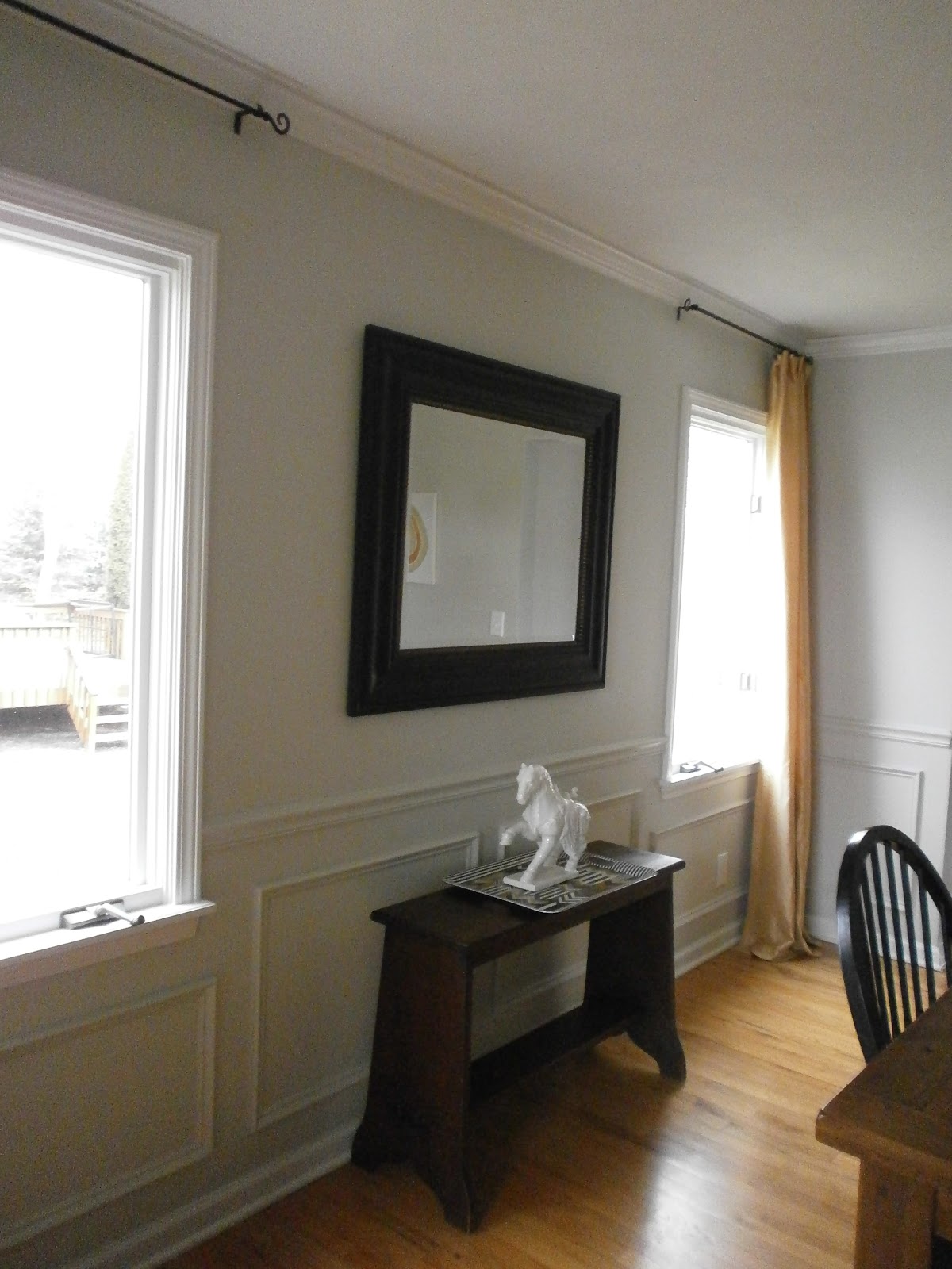
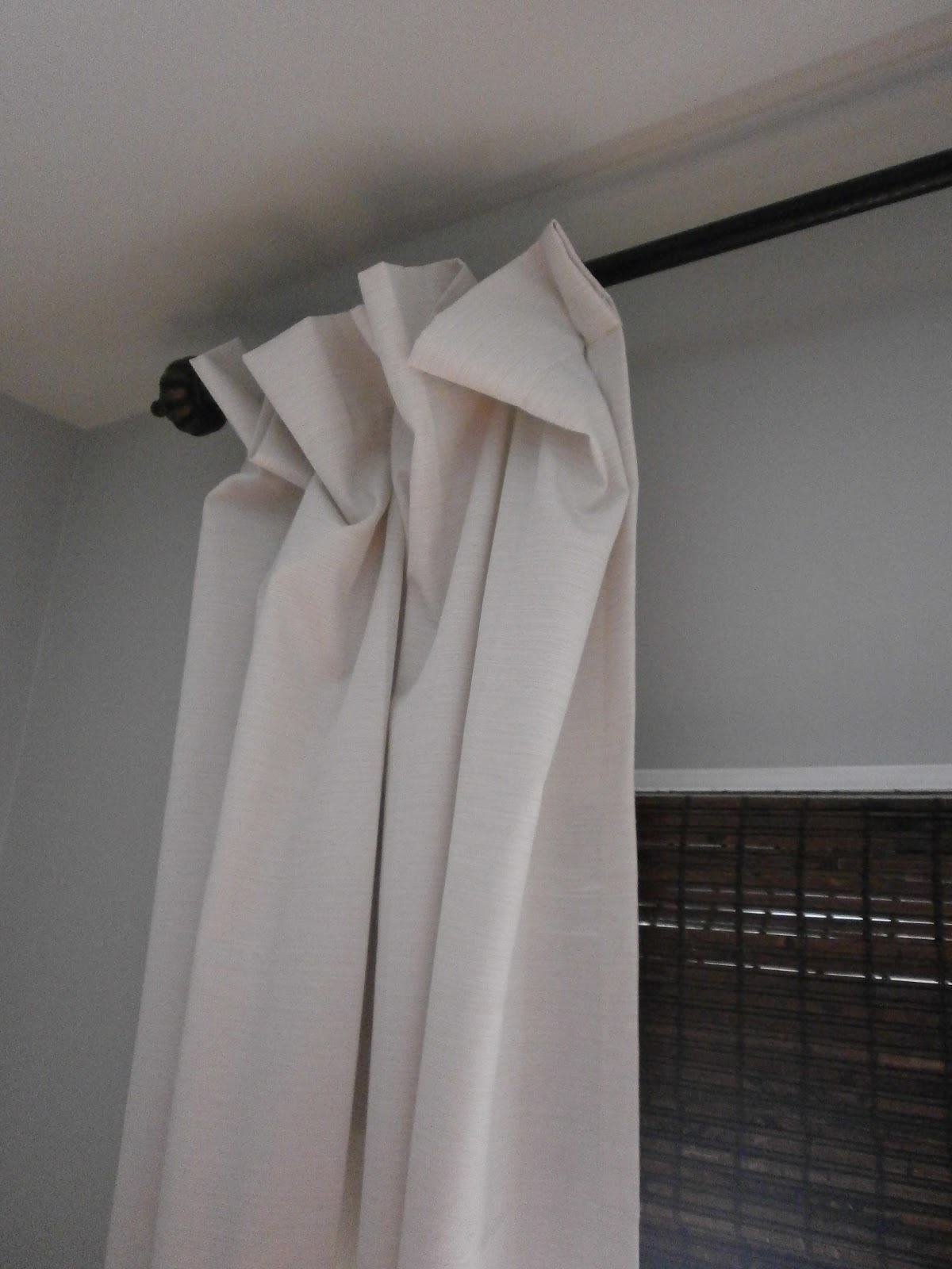
Do you remember my post HERE about the floppy curtain dilemma? If you read that post, you’ll know that I tried to save money and not buy as many curtain rod rings for our drapery panels in the kitchen. Big mistake! I ended up with a droopy mess that looked like this…

Before

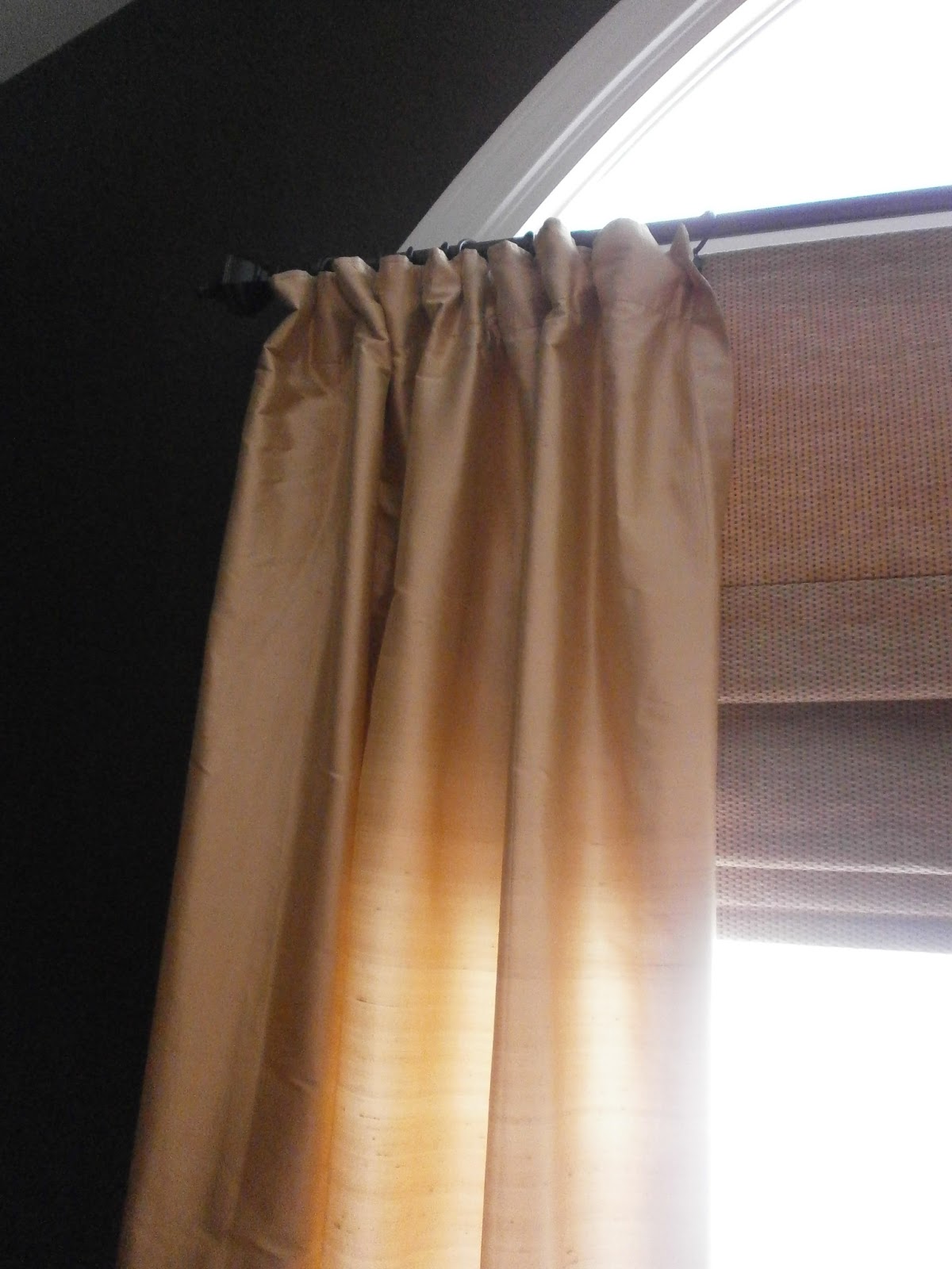
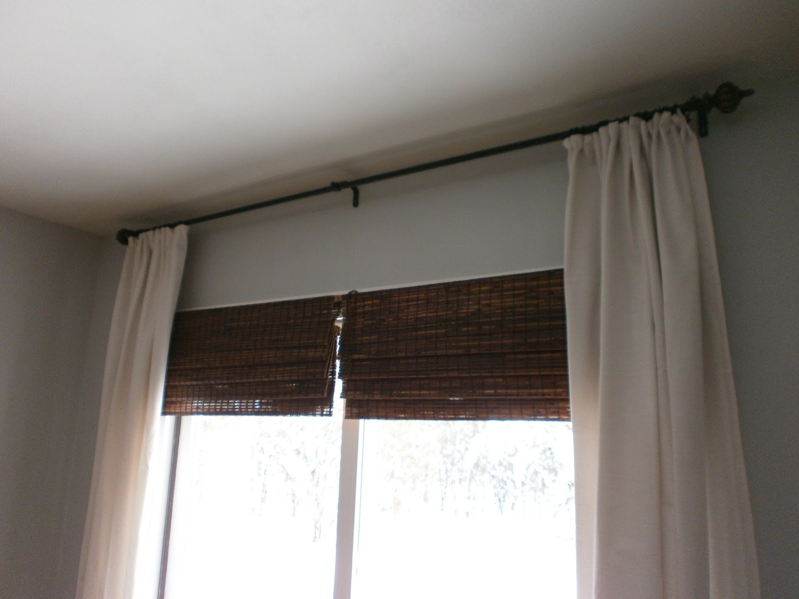
I am usually in the less is more camp, but not with this project! More is definitely better. I used a whopping 17 curtain rings for these 54″ panels! Even though my arms were getting tired reaching to clip them all, I am so happy with how they turned out!
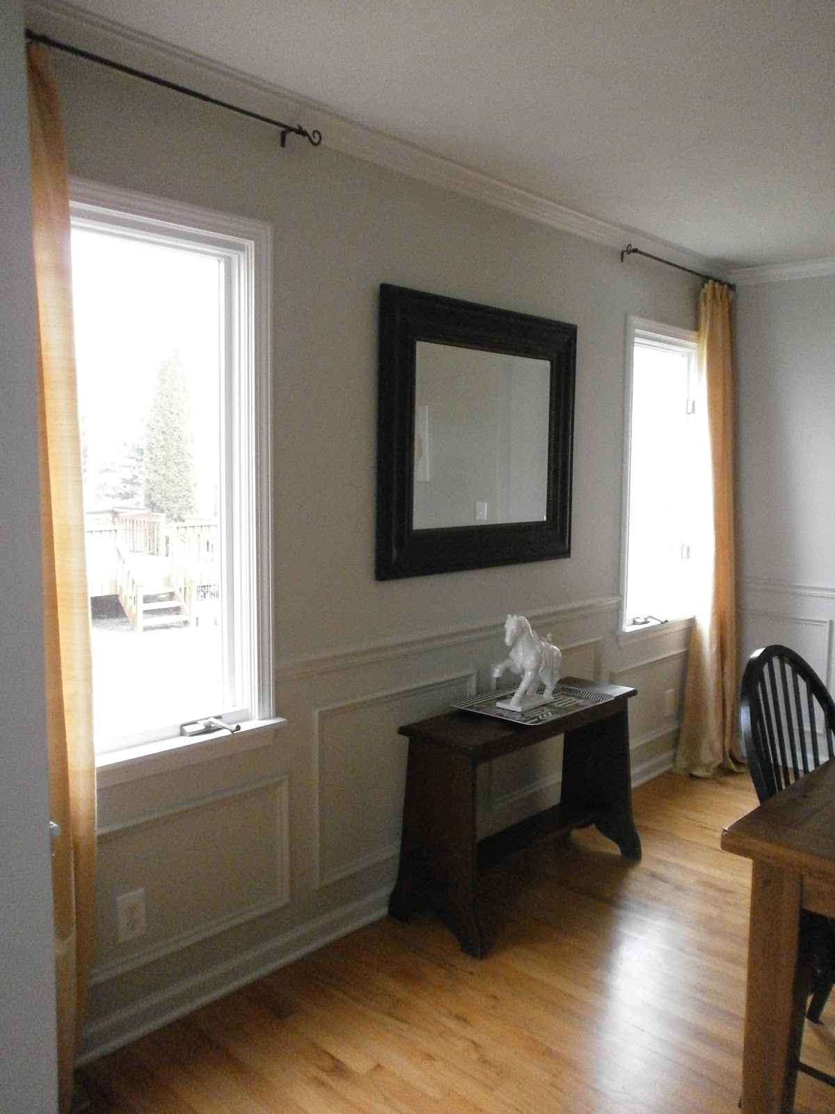
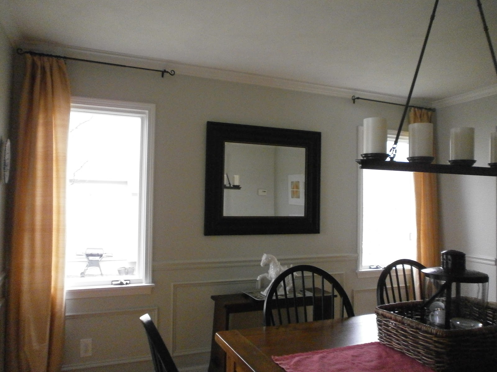
After

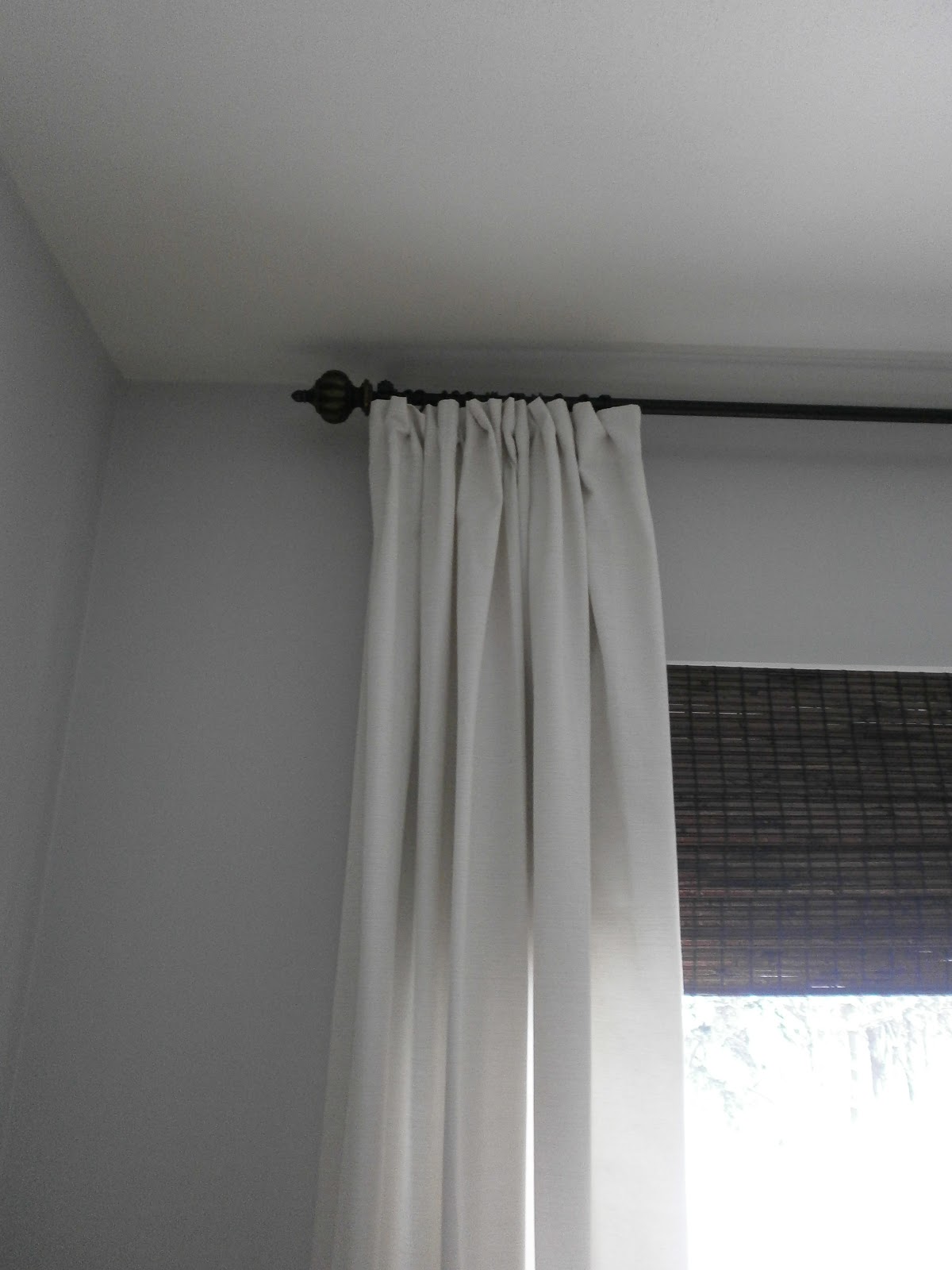
I can’t believe I went from 7 rings to 17 per panel! I actually did these drapes differently than my living room and dining room panels.  With those rooms, I just went with a certain number of rings and hung them up while evenly spacing them out. This time, I started with the outside of each panel and used them as I wanted. If I needed more, I just popped some on the rod from the other side. {Instead of looking at this as making so many mistakes before finally getting it right, I like to think of it as just getting better with age. Ha!} I have the same drapes in our family room, so it looks like I’ll be headed back to buy more rings… again! Ugh… it never ends. But, at least I know now how to tackle this problem. Here’s a run down:

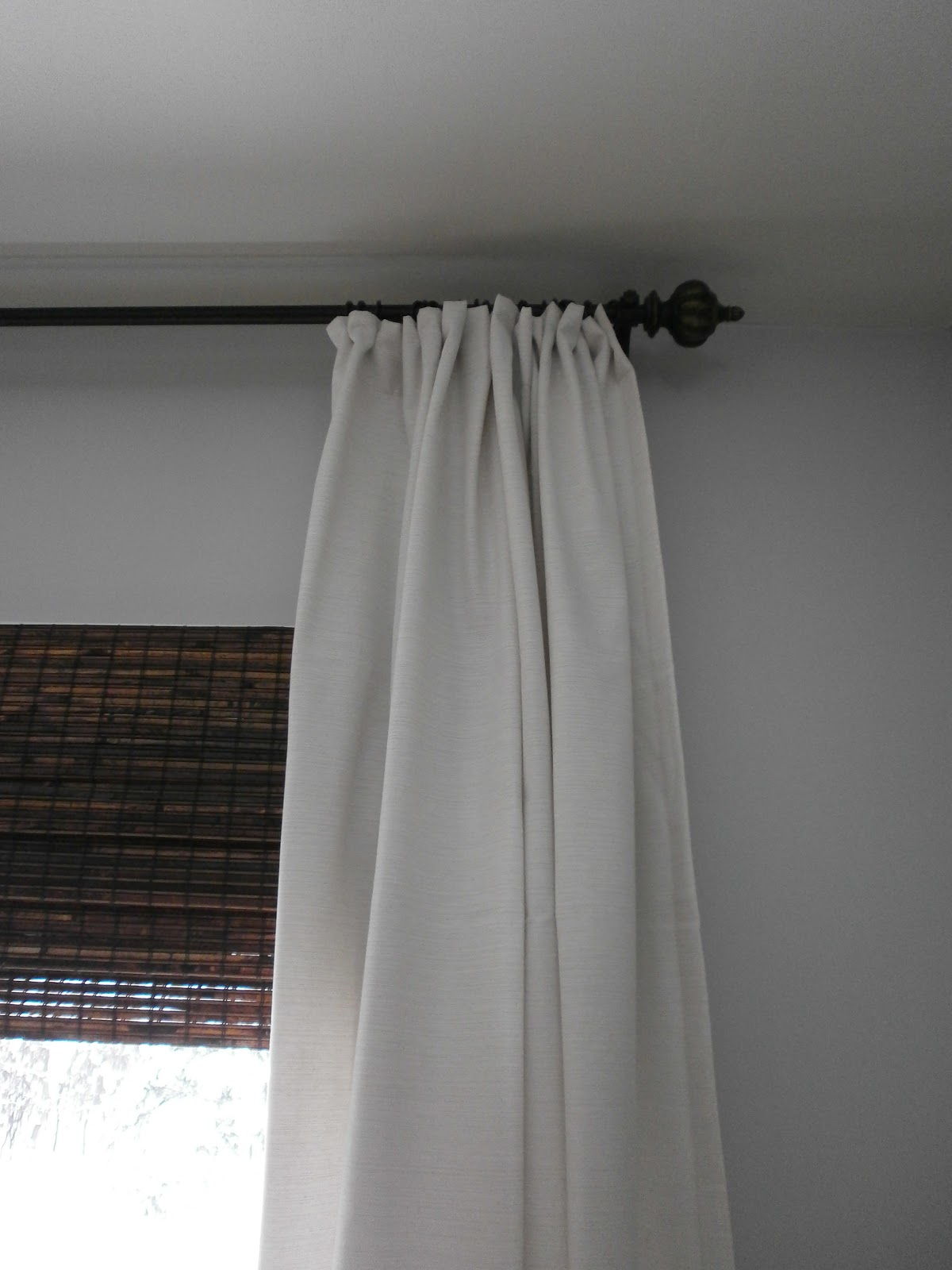
* Start with the outside part of the panels when using the rings.

* Work your way across, pinching the back of the panels as you go and clipping the rings to the back of the panels.

* More is definitelty better when it comes to drapery rod rings! Clip every two inches, or so.

Have you entered the amazing Kimberly Blok Art giveaway?? Today’s the last day to enter. The winner will be drawn tomorrow. Enter HERE!!

The Drapes Are Up!

February 1, 2013 by Amber Filed Under: design, fabric, personal design style


On instagram {amberbinteriors} I gave a little sneak peek into the drapes I finally hung in our dining room. When I repainted the walls, I realized I also wanted to raise the curtain rod up to the crown molding. I already had two silk panels left over from the living room that I didn’t need. They used to be too long for this room, but now with the rod being raised about 6 inches, they’re perfect! So, to tie the two rooms together, they both have the same drapes. Here are some afters…

After

I used my method that I discussed here for hanging the drapery panels. Installing your curtain rod higher than the window molding not only makes the room feel taller, it also opens it up, creating a fresher, more open space. You would be surpised how such a small detail makes a big difference.

Make sure to come back on Monday for an amazing art giveaway!
Happy Weekend!!

A Client Before and After: Art on the Wall!

January 31, 2013 by Amber Filed Under: design, e-decorating, e-design, personal design style


My recent post here showed some e-design projects I have been working on. I am super excited to show some afters today, with the art installed in the master bedroom! It literally feels like Christmas morning when I get these after photos in my inbox. Since I am not able to be there in person with e-design, it is so gratifying to see the vision come to reality. So thank you so much to my client for these photos!  ๐Ÿ™‚

My client was looking for a trio of art pieces to go above the bed. Here is her room before the art:

Before:

Isn’t it a beautiful space?? And here are the afters, with the new art all framed up:

After:

I love how the art finishes that space above the bed, and my client did a great job installing them! Originally, I had suggested different frames, and my client decided to go with this similar version. I think they work beautifully, and it goes to show you that two minds can definitely be better than one! I love the collaboration between client and decorator. It makes it such a fun partnership! The fabric like matting adds great texture to the wall space and the antiqued silver frames balance well with the dark furniture.

Thanks again to my client for allowing me to show these photos on the blog. The amazing art can be found here.

Loving Overlays

January 28, 2013 by Amber Filed Under: design, e-decorating, e-design, personal design style


When shopping for a client, I always try to suggest ways to work with what you’ve got and bring life back into older pieces. When one of my recent clients mentioned she had an IKEA dresser, I immediately thought of the innovative product Overlays to spruce up this piece and make it look chic and custom. If you haven’t heard, let me tell you all about this genious idea! Cheryle Rhuda and Danika Herrick created this innovative product when they saw a gap in the market for easy and inexpensive ways to dress up furniture. Overlays are lighweight, paintable fretwork panels that can be applied to not only furniture, but mirrors, bookshelves and anything you can imagine! What I love about it, is that they are also specially made to fit IKEA furniture! When you visit the ‘IKEA to Overlays’ section of their blog, they show you what fretwork panels work best with each IKEA furniture piece. Here are some amazing after shots of projects using Overlays…

There are so many creative ways to use this! Even if you don’t live near an IKEA, you can transform so many furniture pieces and accessories. You can check out their blog and see more amazing transformations HERE.

Recent E-Design Projects

January 24, 2013 by Amber Filed Under: design, e-decorating, e-design, personal design style


I have been happily busy with some fun e-design projects! Both of these projects are for the same client, looking to make some changes to her spaces and add splashes of modern color. First up, the keeping room directly off of the kitchen…

{Click on images to make larger}

This stylish client already had the chevron rug and Chiang Mai dragon pillows. We just added new seating, tables and splashes of color! The color swatch on the top left is a gorgeous deep green color and will be the TV console color choice! Can’t wait to see it all come together!

Next up, we selected new artwork to go over her bed…

This is the option she chose, and it will look beautiful all framed up!

As spring is getting {hopefully} closer and closer, now is a great time to make changes and updates to your home!

Spring couldn’t get here fast enough! If you follow me on instagram {amberbinteriors} I posted a picture of our thermometer this morning. We’re in the negatives… not fun!

How To Create a Custom Look When Hanging Drapes

January 21, 2013 by Amber Filed Under: design, DIY, personal design style


I have always loved browsing through magazines and seeing how beautiful custom drapes look and how effortlessly they hang on the rod. Love the idea, just not the cost of custom drapes. So, I tried to come up with a way to hang my drapes to give them that custom, pinch pleat look. I’m sure this is nothing new and there are probably so many other great ways out there to do this, but here’s mine…


These are dupioni silk drapes bought from JC Penney about 7 years ago. I wanted to make them look more polished and they also puddle on the floor a bit, so my new trick helped in both areas. I took drapery clips and pinched the back of the fabric, while clipping in place. I clipped them in place about a half an inch down from the top, helping to bring the fabric off the floor a little. I also used 11 drapery clips for each panel. The panels are about 54″ in width and 11 works out great! The odd number allows the clips to be evenly spaced throughout, creating a more unified look. That was my mistake in the past. Take for example, my kitchen curtains…

Trying to save money, I only bought a pack of 7 rings for each panel. See the result… floppy curtains! When these kitchen panels get four more rings each, we’ll be in business! Here is my breakdown for ya…

– If your panels are 54″ wide, go for 11 curtain rings!
– 50″ wide panels, go for 9 rings!
– Stay with odd numbers!
– If your curtains are a bit too long, try this method before taking out the sewing machine!

DIY: Painting A Ceramic Tile Backsplash

January 17, 2013 by Amber Filed Under: design, painting, painting a tile backsplash, painting ceramic tile, painting grout, painting tips


Well, the project is complete! I know you might be wondering if this was worth it and if I’m glad I did it… the answer is yes!! I was so excited to modernize my tiles a bit and go for a cleaner, more updated look.  My tiles were white, which was great, but they had flowers scattered throughout the backsplash.

Before

 (This is an old picture with our previous wall color.)
And here is the tile, all painted and flowerless!
After

I can’t even remember which tiles had the flowers! Here is a breakdown of the materials needed and some helpful tips:
– Scouring pad to lightly sand the tiles and smooth out the flower design. The flower tiles were a little bumpy where the design was, so I just used a Scotch Brite green scouring pad, and it worked fine.
– Microfiber dust cloth to remove the dust from the tiles after sanding.
– Blue painter’s tape and drop cloths to protect your counters. I made sure to tape after the grout, so I could paint the grout that met the counter. That way, it’s all uniform and looks realistic.
– 2″ paint brush (Don’t go cheap with this! Choose the best!)
– Small roller brush (Choose one that doesn’t shed and has a small pile. You don’t want to get paint trapped inside a fuzzy roller, causing a messy paint job.)
– A special bonding primer that bonds to glossy, special surfaces. The clerk at the paint store said this was the best option. (I always use Benjamin Moore paints for all of my projects!) Here is a close up picture of the primer:
Once you have two coats of this primer, your paint will stick very well. It will also be long lasting. My mom said it best:  With this primer on, you’re on the same playing field as your walls. Well said! Now, my paint will be washable, scrubbable, like any wall! 
– Color Matched Paint with a sheen.
To get the exact color match, I took one of my cabinet drawers to the paint store. They can color match it exactly. As we all know and I have learned the hard way in the past, there are a million different shades of white paint! The clerk mixed my color with this paint.
Helpful Tips:
– Once your counters are protected and materials are out, start with the paint brush and prime the grout, first. Use a little paint on the brush, to make sure you don’t full in the grout lines too much. It’s better to do thin layers a couple of times, rather than one goopey layer. (Is goopey even a word? Spell check says no!) In the end, you want to make sure your backsplash still looks like tile and not fiberboard, trying to be tile.
– Wait 24 hours before applying the actual paint. This is important, because the bonding primer needs to fully dry and cure. I was so tempted to just finish in one day, since all of the materials were out. But, patience will pay off.
– When you start your painting the next day, lightly sand the tile again with the scotch brite pad. For some reason, my primer made little bubble marks on some of the tiles. I was so nervous about that! Don’t worry, the sanding will help that and now- no bubbles!
– All in all, make sure you do at least 2 coats of primer and 2 of the paint. It’s a pain in the neck and can be tedious, but then you’re done!
Wow, this is a novel! It was a lot of work, but worthwhile projects always are.  ๐Ÿ™‚
Total cost for this project… $48.00! In the future, I’m sure we’ll replace it with something different, but I will enjoy this for a long time.
So how about you… would you try it??
I am linking this project up to Savvy Southern Style:

Painting Ceramic Tile {The Primer is On!}

January 16, 2013 by Amber Filed Under: budget saver, design, painting, painting a tile backsplash, painting ceramic tile, painting grout


Well… what’s done is done! I have started my painting project in the kitchen. Now, no turning back! A while ago, I posted about re tiling our backsplash and choosing a grout color. Well, I have taken this project into my own hands and decided on something entirely different. I have never liked our flower design on some of our backsplash tiles. I like that the tile is white, but the flowers made the backsplash more dated. White subway tile would be ideal, but I’m all about working with what you’ve got in 2013! There will be more details to follow, but as a money saver, I decided to paint the tiles with a special primer/ paint that adheres to tile! Here is an update, all primed and ready for the topcoat…

Sorry that the picture is grainy. It’s a phone picture on a cloudy day. After two coats of primer, I can hardly see the flowers! Yay! I had to let the primer cure overnight, so I will be back at this in a little while. We also have white cabinets, so I brought a kitchen drawer into the paint store to get a color match. I can’t wait to show completed pictures!

Have you ever painted tile?? Would you ever be as crazy as me and try it??

Creating Contrast in Your Rooms

January 14, 2013 by Amber Filed Under: design, paint colors, painting, painting tips, personal design style


I received an e-mail recently from a reader, asking about my dining room transformations and how to choose the best color in your space. I thought it would be a great post to present on the blog and open up the discussion with all of you! My original paint color in the dining room was Bungalow Gold by Eddie Bauer. While I enjoyed the color for a while {7 years, to be exact!}, I needed a change. So, I decided to stencil one wall, after receiving a free stencil for a product review.

While the stencil was fun and something new, I still wasn’t feeling it. I realized the main reason why, was because there was not enough contrast in the room. The oak floors blended with the table, which blended with the walls. I have been meaning to make some of my spaces lighter and brighter, and I knew this was the room to start! This space did not need another warm tone… it had too many, already. What this space needed was some contrast. It needed a cooler color in the blue/gray/green family. Fast forward to my decision… and we have Halo, by Benjamin Moore. I love that it appears almost white when the sun is shining, yet provides that cool tone of gray/green that this room needed. I know I have already shown the dining room reveal here, but I thought it was also worth mentioning why this color was chosen and how to achieve contrast in your home. Here is the new paint color:

For me, adding a cooler color helped to break up all the similar tones, and I am so much happier. The paint brush can be put down, for now!

How about you, do you like more of a contrast, or similar tones throughout?

What’s New at Joss and Main

January 11, 2013 by Amber Filed Under: design, personal design style


If you haven’t shopped here before, Joss and Main has great items at amazing prices. If you see something you love, you have to act fast, because sales run out in hours and days. Here are some of my favorite items currently for sale and still in stock {last time I checked!}

 Sophie Floor Pillow
Zyanya Box Set
Elmore Storage Basket
Voyage Chest
Sussex Club Chair {Set of 2}
Fordwich Rug
Preserved Boxwood Set 
I could go on and on! I actually just purchased a new bamboo print ottoman cube before the holidays and love it! If you are not a member of this free flash site, sign up HERE! The items shown above will no longer be on sale after this weekend- some end as early as Saturday!
Happy Shopping!!
 

  • « Previous Page
  • 1
  • …
  • 20
  • 21
  • 22
  • 23
  • 24
  • …
  • 26
  • Next Page »
Welcome!

Hi, I'm Amber... a wife, mom and interior decorator. I am the writer of Simple Dwellings and the designer behind Amber B Design. Blog topics are all things design, with the occasional DIY attempt! Thanks for stopping by Read more...

  • Bloglovin
  • Email
  • Instagram
  • Pinterest
  • Twitter

Blog Posts, Straight to Your Inbox

Popular Projects

A dining room with white walls and wooden table.
A black door with white curtains and a red chair
A staircase with black and white chevron pattern on the steps.

Blog Love

  • Addison’s Wonderland
  • A Thoughtful Place
  • Alison Giese Interiors
  • Amber Interiors
  • Bailey McCarthy
  • Caitlin Wilson
  • Chris Loves Julia
  • Classic Casual Home
  • Cottage and Vine
  • Design Indulgence
  • Dwell by Cheryl
  • Eddie Ross
  • Elements of Style
  • Emily A Clark
  • Emily Henderson
  • Gallery No Eight
  • Hi Sugarplum
  • House of Jade
  • Jana Bek
  • Juniper Home
  • Kate Marker Interiors
  • Lucy Williams
  • Monika Hibbs
  • Our Fifth House
  • Pencil and Paper Co
  • Rachel Parcell
  • Rambling Renovators
  • Pure Style Home
  • Sita Montgomery
  • Studio Mcgee
  • The Makerista
  • The White Buffalo Styling Co
  • the Zhush
  • Traci Zeller
  • Young House Love

Copyright Amber B Design © 2025 ยท Design by Britt Douglas