Amber B Design Studio

Interior Design & Decoration for the South Florida region

  • Home
  • About
  • Services
  • Portfolio
  • Blog
  • Press
  • Contact

If My Blog Was A Room – Next Up – Interior Design Musings

October 12, 2011 by Amber Filed Under: blog room series


Happy Wednesday and welcome to the series If My Blog Was A Room… where I pose the challenge to think of your blog as an actual space. What would that space look like? I am so excited to have Mandi here, from her blog Interior Design Musings. Her blog is full of gorgeous spaces and beautiful ideas. She balances traditional with modern so well and I absolutely love what she came up with for this post! Without further adieu, here is what Mandi came up with!

What a treat to be here today participating in Amber’s series “If my blog were a room.”

I’ve been designing interiors for several years, but this past Spring I revamped my entire blog and launched my own interior design business here in Birmingham, Alabama.  So, I put a lot of thought into my logo design, both for my blog and interior design business.  I really wanted it to reflect my sense of style.  But, you know, . . . funny thing about graphic design – just because a logo makes you think of certain things, does not mean other people will conjure up those same thoughts.  So, for Amber to think of expressing a blog in terms of a room is simply genius!  
With that, here are my thoughts on what Interior Design Musings would look like as a room . . . 
source
Great Architectural Details
 For a room to be really special it needs some architectural details.  I like very traditional elements which help to create a timeless room.  I adore the floating staircase, the mission style newell posts, and if you look at the wall going up the staircase you can see even more trim detail.  Architecture is a great “first layer” to any space.
source
This stunning room is bold, but not fussy or overdone.  The deep crown moulding, chair rail, and amazing arched windows define the space.
source

Traditional Elements
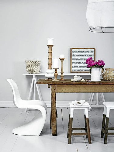
There would be at least one fine old casement piece in Interior Design Musing’s room.  These tend to ground a space and give it a traditional foundation with a high end feel.  This chest is a stunning example.
source
That’s the thing about an antique piece, even one can make a huge statement in a room.
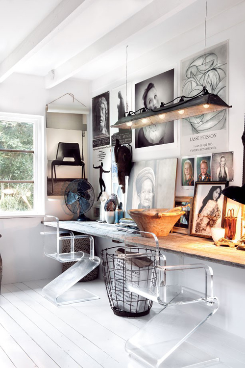
source
Modern Flair
Every great room includes an unexpected modern element.  This is what gives you the “wow” factor when you enter the space. This modern edge can take many different forms from lighting, accessories or artwork as seen below.   
source
It can also be incorporated in a more subtle way – like the frame of a mirror or a special accent chair.
source
Pop of Color
Add a unexpected pop of color for interest (like the orange in my logo).  This can totally change the direction of a room.  Also, if this pop is included through accents pillows and small furnishings these can be easily changed out for a fresh new look.
source
Or pick a color you LOVE, and you will never get tired of it!
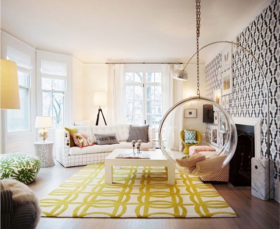
source
Balancing Act
I like to think that Interior Design Musings achieves the balance.  When you have enough of both, the room feels right.
source
The goal is to achieve the balance without making it obvious.  Notice in this space the chandelier, table base and flowers feel girly while the leather chairs, wall color and artwork feel like a men’s den.  
source
I hope this has given you a glimpse into the window of my blog’s room.  It was so much fun dreaming about this!  Please come see me over at Interior Design Musings.  Thank you, Amber!  M.
Thanks so much for being here today, Mandi! I love the way you showed rooms that are traditional, but with a modern twist. I also love a space that has a pop of orange- it’s a great color! Definitely stop by Mandi’s blog… you’ll be so happy you did!

If My Blog Was A Room – Next Up – Third Floor Design Studio

October 5, 2011 by Amber Filed Under: blog room series


Happy Wednesday and welcome to the series If My Blog Was A Room… where I pose the challenge to think of your blog as an actual space. What would that space look like? I am so excited to have Kimberly here, from her amazing design blog Third Floor Design Studio. Kimberly’s blog showcases fun and beautiful DIY projects and pictures of her gorgeous home. I get so much inspiration when I visit her blog! Here is her great blog header:

And here is what she came up with. Take it away, Kimberly!

If my blog was a room…. IF my blog was a room?! This question has been really fun to think about. I feel like my blog actually does a pretty good job of representing my design taste — a litte bit of eclectic, a dash of rustic, and a lot of contemporary color! Since starting this blog, I’ve definitely seen it evolve. I’ve come to realize my taste through the daily posts of inspiration I share, the DIY projects I attempt, and in the pieces I chose for our home. It’ll never stop changing {that’s for sure}, but for here and now this is what my blog would fashion if it had walls!

eclectic: when every single piece has a purpose. a hard look to achieve {ironically}.

source
source
source
source
Rustic: cozy and bold. 
source
source
stools dipped in paint
source
Contemporary & Colorful: bold patterns. mix and match. no color no fun. that includes a little pink…
source
source
source
source
source
source
source
Thanks to Amber for letting me hang out here today! Come stop by Third Floor Design Studio anytime.

Thanks so much for being here, Kimberly! The images she chose are gorgeous and remind me very much of her chic blog. I love the mix of design styles and taking it up a notch with fun color! Stop by Kimberly’s blog for some great design inspiration. And head on over there right now to enter her fabulous fall wreath giveaway with Nu and Boo. Enter HERE!

If My Blog Was A Room – Next Up – Mix and Chic

September 28, 2011 by Amber Filed Under: blog room series


Happy Wednesday and welcome to the series If My Blog Was A Room… where I pose the challenge to think of your blog as an actual space. What would that space look like? Today, I’m happy to have one of my favorite blog friends doing the series! Jessie from Mix and Chic writes an amazing design blog and shows so much gorgeous inspiration! With all of the design sources out there on the internet today, I am always so amazed that she shows rooms and homes that I have never seen. They are always jawdropping designs, too! Here is Jessie’s chic blog header:

And here is what she came up with:

Hi Simple Dwelling readers! I am Jessie from Mix and Chic. Thanks to Amber for inviting me to participate in her fun series ‘If My Blog Was A Room’. I had a great time imagining what my blog would look like! Overall, the room would feel fresh, chic and cheery with vibrant colors as accents. Additionally, it would also includes my favorite color, green. For instance:

Luxurious floor to ceiling curtains in a cheery color, perhaps in a salmon red shade.
via
Gorgeous fresh cut peonies in pink.
via
Plenty of green accessories such as a series of modern green artwork and a large geometric rug.
via
Whimsical and fun elements or accessories like the sheep above.
via
A beautiful green sofa or two for get togethers.
via 

A large white bookcase with a pretty accent color at the back to display my favorite finds and quirky objects.
via
There you have it. I hope you have fun checking out my imaginary room. Thank you Amber for having me over today!
Thanks so much for being here, Jessie! I love the chic, fun design elements! Fresh peonies are also one of my favorites. And I love all the gorgeous green in the spaces! Jessie is currently doing a fabulous book giveaway that ends tomorrow! Click here to enter! Or, just stop by her gorgeous blog- Mix and Chic– you’ll be so happy you did!

If My Blog Was A Room – Next Up – Conspicuous Style

September 21, 2011 by Amber Filed Under: blog room series


Happy Wednesday and welcome to the series If My Blog Was A Room… where I pose the challenge to think of your blog as an actual space. What would that space look like? I am so excited to have Stacy here from her design blog Conspicuous Style. Her blog has amazing design inspirations with a tour of her gorgeous home- I have already bookmarked some of her beautiful design ideas for our home! Here is her great blog header:

And here is what she came up with! Take it away, Stacy!

Thank you so much, Amber, for having me.  It is a real honor and I am thrilled to be here.

My blog is different from my house.  I see it as a place to dream, and dream big.  As a lifelong believer that more is generally more, I tend to post about rooms that I may never have (because they are too expensive, not child friendly, don’t fit in with the rest of my house, etc.)   However, I do think that my blog is a reflection of me… my feelings, thoughts, desires, and things that I truly love.  So, if my blog was a room, it would be a room filled with mirrors, and might look something like this:


Because I am a dreamer and use my blog to express those dreams, it would also have a to-die-for patio and view:
And a touch of modern…maybe even more modern than I would do in real life, like black ceilings:

It would also have some big contrast, like ghost chairs and rustic stone walls, because what I’m inclined to write about can change a lot from day to day:

There would most definitely be a crystal chandelier, as my obsession with them has been renewed:


An last, but certainly not least, it would have to have dark stained floors, as I post almost weekly about how much I dislike my orange wood floors and want to change them to brown.  Actually, I was thinking that it would be difficult to fit all of my thoughts into one image, but this one is a close summary, with its dark floors, aged mirrors, modern wallpaper and crystal chandelier — throw in a  stone wall and it would be perfect:

Image Sources

Thank you again Amber.  It was a pleasure being here!
Stacy

Thanks so much for being here, Stacy! I love the elegance of these rooms, with their gorgeous mirrors, stunning chandeliers and dark wood floors! I also love to add a bit of rustic to the mix, for added interest. Thanks for the amazing eye candy! To see more beautiful images and great DIY projects, stop by Stacy’s blog– you’ll be so happy you did.

If My Blog Was A Room – Next Up – Ten June

September 14, 2011 by Amber Filed Under: blog room series


Happy Wednesday! It’s time for the series If My Blog Was A Room… where I pose the challenge to think of your blog as an actual space. What would that space look like? I am super excited to have Michelle here, from her design blog Ten June. Michelle’s blog is full of gorgeous design ideas and beautiful before and afters of her home. Her blog is also laugh out loud funny- it’s like talking to a great friend when I read her posts! Without further adieu, here’s Michelle-  

Hi friends! I’m Michelle from Ten June. I’m happy to be popping by Amber’s blog today answering the fun question- if my blog were a room, what would it look like?!

I’d like to think that my blog falls in line with my personal style: young traditional with classic, clean lines and hints of rustic and eclectic elements. And perhaps a bit of wit, since I’d like to think I’m good for a laugh or two. Y’all are laughing with me, not at me, riiiight? ; ) I try not to take life too seriously and I’d like to think my blog and design aesthetic reflect that!
 via
 via
 via
 via
I’m absolutely head over heels in love with all shades of blue, particularly navy. I’ve incorporated the color, most of the time paired with white, in most every room of my house. In fact, I painted the walls in my dining room navy blue! Pair that color scheme with some vintage furniture and a subtle hint of cottage charm and voila! You’ve got my blog in a room : )
 
via
via
via
via
So there you have it! Ten June, the room! Thanks so much for having me, Amber!

Thanks for being here, Michelle! The rooms she chose are gorgeous and remind me so much of her blog- chic, fun and super stylish! Stop by her blog– you’ll be so happy you did!

If My Blog Was A Room – Next Up – ROOMS

September 7, 2011 by Amber Filed Under: blog room series


It’s Wednesday and time again for the series If My Blog Was A Room… where I pose the challenge to think of your blog as an actual space. What would that space look like? I am so excited to have Melissa here, from her blog ROOMS. I have recently discovered her amazing design blog, and we have become fast friends! She has a great eye for design, and I can’t wait to see what she came up with. Here is her great blog header:

And here is what she came up with. Take it away, Melissa!

Hi everyone!  If my blog were a room it would look something like this…

I love the neutral and sophisticated colors in this office space spiced up with the brightly patterned window treatment and accessories.  I drool over this image every time I see it, so I can totally envision myself working there each day! 
via decor pad

On the wall would be something like this to display paint chips, fabric samples, and other inspiration.
source
A beautifully accessorized bookcase with a brightly painted or upholstered back would be a MUST!  Though I have to admit, there would be no ‘horns’ in mine – it’s not really my thing!

via

In a dream world, I would have fresh flowers every day sitting on my desk.

via

A Barcelona Chair would be there, of course – need I say more!

source
The room would open up to a beautiful deck with over-sized hanging swings and a view of the beach…ahhh!
source
Thanks Amber for having me be apart of your series!

Thanks so much for being here, Melissa! I love the idea of a chic, white Barcelona chair and adding a pop of color behind book shelves. And the addition of fresh cut flowers would brighten up any work space! To check out more of Melissa’s great ideas, visit her design blog here.

If My Blog Was A Room – Next Up – The Mustard Ceiling

August 3, 2011 by Amber Filed Under: blog room series


Today is Wednesday and time for the series, If My Blog Was A Room… where I pose the challenge to think of your blog as an actual space. What would that space look like? I am so excited to have Elizabeth here today, from her design blog The Mustard Ceiling. Elizabeth has one of those amazing blogs with so much great design information, fun DIY projects, and amazing before and after photos of her gorgeous home! Here is her great blog header:

And here is what she came up with! Take it away, Elizabeth-

Hello Simple Dwellings readers! I am so excited to be here today to participate in Amber’s fun series, “If My Blog Was a Room.”

If my blog were a room, it would be…
Source

Source

Soft and neutral, with a pop of fun mustard or coral….

Source
Source

and of course…

Source

a fabulous chandelier and a mustard ceiling…

Align Center
Source
Thank you Amber for having me over today!
Thank you so much for being here, Elizabeth! The rooms you chose are gorgeous. I absolutely love the fun zebra print ottomans paired with the serene wall color and the gorgeous wall treatment in the last photo. These images definitely remind me of your blog!
Stop by and visit Elizabeth’s blog today! You’ll be so happy you did!

If My Blog Was A Room – Next Up – Marcus Design

July 27, 2011 by Amber Filed Under: blog room series


Today is Wednesday and time for the series If My Blog Was A Room… where I pose the challenge to think of your blog as an actual space. What would that space look like? Today, I am so happy to have Nancy here from her design blog, Marcus Design. She is a very talented DIYer, has glamorous and chic design taste and shows gorgeous before and afters of her home! Here is her great blog header:

And here is what she came up with! Take it away, Nancy-

Hello Simple Dwellings readers! I am so excited to be visiting Amber’s fabulous corner of the blogosphere today. Thank you to Amber for inviting me to participate in her series, ‘If my blog was a room.’ I had fun imagining what it would have to include: white with a heavy dose of glamourous black; silver, gold & mirror; and finally a touch of fabulous pattern. Overall it would have to have a glam and elegant feel!!

Image 1 – http://www.christinamurphyinteriors.com/
Image 2 – http://www.highglossmagazine.com/
Image 3 – ruemag.com
Image 4 – ruemag.com
Image 5 – houseandhome.com

Wow- gorgeous images! I love the bold, dramatic effect that a black and white room makes! I love all of the pattern, wallpaper and the stunning pop of red in the last image’s chandelier! Thanks so much for being a part of the series, Nancy! If you haven’t already, definitely stop by her blog today- there are so many eye candy images to see!

And don’t forget- tomorrow is the last day to enter the fabulous giveaway from Olive Leaf Stencils! Enter here!

If My Blog Was A Room – Next Up – Strictly Simple Style

July 20, 2011 by Amber Filed Under: blog room series


Today is Wednesday and time for the series If My Blog Was A Room… where I pose the challenge to think of your blog as an actual space. What would that space look like? I am super excited to have Karen here from her design blog Strictly Simple Style. Her blog is so inspiring because she tackles DIY projects that are simple, affordable and very beautiful! I always like to see what she is up to next, and her genuine, sweet personality makes her blog so fun to read! Here is Karen’s great blog header:  

And here is what she came up with! Take it away, Karen-

Source


Hello Simple Dwellings readers. My name is Karen Evans and I’m so honored to be participating in Amber’s “If My Blog Were a Room…” series. After searching high and low for the perfect image, I finally settled on the room pictured above, not because it precisely represents my personal style, but because it contains elements of the principles that I so often discuss on my blog Strictly Simple Style.

The objective of my blog is show others my approach to creating a beautiful home and lifestyle when time and resources are at a minimum. As a wife and mother of two, like so many blog readers, I don’t have the patience or inclination to complete time consuming DIY projects that require loads of expensive tools. The image above is a great example of an attractive, family friendly look that is achievable on a limited budget and wouldn’t require a huge time commitment to pull together. Let’s examine what we have:

A White Slipcovered Sofa: I love me a white slipcovered sofa for its versatility and the ability to toss it in the wash whenever there is a spill. Believe it or not, white is one of the best choices for a slipcover. They can be stain treated, you don’t have to worry about fading and simply switching out the pillow covers can give you a new look.

Simple Tables Painted White: A single visit to a thrift store would be all it takes to find a pair of end tables, or even two tables of different styles that could be sprayed white for a consistent look. I imagine the owner of the space above looking beyond the finish of tables and concentrating on ones with an appealing shape and scale that works with the sofa. The coffee table, which appears to be pine, looks as though it received a coat of white to the base but the top was left as is in an effort to avoid the need for constant upkeep.

Inexpensive and Creative Use of Accessories: The accessories in this room are without a doubt my favorite element for a couple of reasons. First, the use of multiple patterns and colors gives us a sense of the homeowner’s personality. I envision a young, single woman with more creativity than cash. She loves to sew and uses scraps or remnants that she buys at a discount to sew her own pillows when she is craving a new look for one of her rooms. Short on money for wall art, she frames more of her fabric scraps in inexpensive embroidery hoops. (I have no doubt that this frugal girl would use those 40% off coupons that Hobby Lobby and Michaels offers weekly to get the hoops at a discount!) Finally, this thrifty homeowner knows how to embellish what’s plain to make it special. Plain white lampshades get a fresh look with the addition of ribbon, a quick and low-cost way to get a finished look.

A Neutral Background: If you love to switch up the look of your space quickly and without spending a small fortune, going neutral with your wall color and high ticket pieces is a smart choice. Let’s say our young, single homeowner got engaged to a man who wasn’t about to live in a house with even a hint of pink, it would be no problem to update the space in an affordable manner. Swapping out the pillow covers for ones in his favorite colors, replacing the wall art for another piece (maybe a thrift store mirror with its frame sprayed in a coordinating color), and removing the pink rug and ribbon on the lampshades would result in a more masculine look while still retaining the feel that our homeowner loves. The best part, all of this could be completed in a single weekend.

The simple principles that were used to pull together the look of this room are an accurate representation of the type of information that I like to share on my blog. If you are interested in saving time and don’t want to sell a kidney to afford the lifestyle you desire, stop by my blog for more strictly simple ideas for your home.

Thank you Amber for allowing me to be apart of “If My Blog Were a Room…”


Karen is my kinda girl- I love that her vision for design has affordable DIY projects that are also so chic and beautiful! I love the ideas of white slipcovers and neutral backgrounds- the accessories can be the color and get changed out without breaking the bank! And the way the leftover fabrics are displayed is an amazing idea! Thank you so much Karen, for being a part of the series! For more affordable, chic design ideas, visit her blog here.

If My Blog Was A Room – Next Up – The Design Pages

July 13, 2011 by Amber Filed Under: blog room series


Happy Wednesday! It’s time for the series If My Blog Was A Room… where I pose the challenge to think of your blog as an actual space. What would that space look like? I am super excited to have Carol here from her amazing blog, The Design Pages. Carol’s design blog is packed with creative, beautiful DIY projects, beautiful design and a very talented lady! I am so happy I found Carol’s blog and that she is a part of the series! Here is her great blog header:

And here is what she came up with. Take it away, Carol!

Hi everybody.  I’m so happy to be part of Amber’s awesome series.  I love that Amber is trying to see whether there is a correlation between our blogs and the things we love in design.


When I started looking for images I knew I had to start with the colours.  It took me a really long time to decide on the colours for my logo.  I told my graphic designer that I didn’t want blue and orange but like all good designers she was able to read between the lines and in the end that’s the one I loved the most.


This room says simple, uncluttered, slightly retro and stylish.

via
I also love a space that has one perfectly put together object or element that says wow.
via
I love the warmth of an exposed brick wall and I really love how this homeowner mixed in some industrial elements.
via
I always go for a simpler kitchen but think the collection makes it anything but dull.
via
At the end of the day I would love to kick back with friends and family and enjoy some amazing times by the pool.
via
Thanks Amber for having me today.  It’s been really fun exploring my blog’s personality.

Thanks so much for being here today, Carol! These images are stunning- the orange runner down the stairs is so stylish. Definitely stop by and check out Carol’s blog! While you’re there, check out her DIY Projects tab- I am sure you will want to try one of her amazing projects!

  • « Previous Page
  • 1
  • 2
  • 3
  • 4
  • Next Page »
Welcome!

Hi, I'm Amber... a wife, mom and interior decorator. I am the writer of Simple Dwellings and the designer behind Amber B Design. Blog topics are all things design, with the occasional DIY attempt! Thanks for stopping by Read more...

  • Bloglovin
  • Email
  • Instagram
  • Pinterest
  • Twitter

Blog Posts, Straight to Your Inbox

Popular Projects

A dining room with white walls and wooden table.
A black door with white curtains and a red chair
A staircase with black and white chevron pattern on the steps.

Blog Love

  • Addison’s Wonderland
  • A Thoughtful Place
  • Alison Giese Interiors
  • Amber Interiors
  • Bailey McCarthy
  • Caitlin Wilson
  • Chris Loves Julia
  • Classic Casual Home
  • Cottage and Vine
  • Design Indulgence
  • Dwell by Cheryl
  • Eddie Ross
  • Elements of Style
  • Emily A Clark
  • Emily Henderson
  • Gallery No Eight
  • Hi Sugarplum
  • House of Jade
  • Jana Bek
  • Juniper Home
  • Kate Marker Interiors
  • Lucy Williams
  • Monika Hibbs
  • Our Fifth House
  • Pencil and Paper Co
  • Rachel Parcell
  • Rambling Renovators
  • Pure Style Home
  • Sita Montgomery
  • Studio Mcgee
  • The Makerista
  • The White Buffalo Styling Co
  • the Zhush
  • Traci Zeller
  • Young House Love

Copyright Amber B Design © 2025 ยท Design by Britt Douglas