Amber B Design Studio

Interior Design & Decoration for the South Florida region

  • Home
  • About
  • Services
  • Portfolio
  • Blog
  • Press
  • Contact

E – Design Complete – The Living Room

May 16, 2011 by Amber Filed Under: Uncategorized


I recently received an e-mail from a reader, in search of some new design ideas! She was looking for some changes to her living room and den, to match the gorgeous dining room remodel she recently finished. There is more on her inspiration image and dining room furniture here. I continue this week with the living room design. As I stated in my last post, she was looking for beach inspired colors, along with pops of color in the furniture and accessories. Here is a snapshot of her living room now:

I love the wood floors and all the room’s natural light from the big window! Behind this photo is the entry into the house, with a staircase and doorways leading into the dining room and kitchen. I completed the entry’s design here. Across the wall of windows are double doors leading into a den. With all of the rooms exposed in some way, she was looking for a better flow with color and furniture selections. Here is what she was looking for in this room: she wanted to keep the existing tv cabinet, lighten up the walls with a blue/gray/white color and add colorful furniture and accessories. With a toddler in the house, she was not looking for a coffee table at this time. So, here’s what I came up with!

I tried to keep the room’s overall look light and airy, by suggesting the walls and baseboards be painted Paper White (1590) in an eggshell finish by benjamin moore. (Which is the design board’s background color!) On the tv cabinet wall, I suggest painting two, wide horizontal stripes in Sterling (1591), the next darker color on the swatch. These stripes will be in a semi gloss finish and give the wall some added interest and depth. (This wall is opposite the chain link stenciled wall I spoke about here.) On this wall, I also suggest she purchase two large, rectangular mosaic mirrors and hang on either side of the tv cabinet. (This is on the bottom right of the design board.) With a toddler, I wouldn’t suggest she lean the mirrors against the wood floors at this time. I suggest she purchase the same chenille/jute rug as in the entry, but in a 5×8. It’s a soft and durable material on little feet! The main seating in the space will be this comfortable sofa in a flax color. This sofa is smaller than her existing sectional and will help with ease of flow in the space. The chic, affordable pillows on the sofa will add pops of color to the space. In front of the sofa is this beautiful ikat ottoman, which is a great alternative to a coffee table. On the ottoman is a sturdy tray, for placing sippy cups! When it’s naptime and the adults have free reign of the space, this beautiful vase can be out for show, while also incorporating a pop of color. Flanking either side of the sofa will be two of these floor lamps. They can be placed about 6 inches behind the sofa on either side, to keep out of child reach. On either side of the couch, she can purchase 2 natural wood side tables at a great price! The chosen drapery for this room is a pretty floral, which ties the inspiration colors together. She has 8 ft. ceilings, so I suggest she purchase this drapery in 96in. and hang to the ceiling. It draws your eye up, giving the illusion of a bigger space. To add extra depth to the window, I suggest she also hang woven shades onto the window casing. Since these shades come with long cords, I suggest always securing the cords out of reach of children. The clock is a fun accessory and can be hung to the right of the door leading into the kitchen. (Not seen in the living room photo above.) The sailboat pillow is a nod to the beach inspired theme in the space, and is a great deal! I suggest she purchase 2 wing back chairs and place opposite the couch, a couple feet in front of the double doors leading to the den. To me, this style of chair is reminiscent of coastal inspired living! The pillow on the chair brings a pop of color into the space. In between these chairs, I suggest this fun side table in a shiny green finish. It can easily be moved out of the way when not in use, but also have safe, rounded curves when in place. So there you have it! My interpretation of beach inspired living with pops of color for fun!
Check back later this week, as we move on to the den!   

If you would like some design ideas for your home, e-mail me at [email protected]. I would love to work with you!    

E – Design Complete – The Entry

May 13, 2011 by Amber Filed Under: Uncategorized


I was so excited when I received an e-mail from a sweet mom looking for design ideas for her first floor. She has a one year old and is looking for kid friendly spaces, more storage and a beach inspired color palette. She wanted to have soft blue grays/whites on the walls with pops of color in the furniture and accessories. She recently purchased this beautiful farmhouse table and gray wicker chairs from restoration hardware for her dining room.

With the dining room well on it’s way, she was looking for some design changes in the rest of the rooms on the first floor. She sent me this beautiful inspiration photo when thinking about the colors in the rooms.

 via
What a fun project! I’m so honored to be asked to work on these designs! She has a great starting point with the gorgeous dining room furniture, and her rug inspiration has some of my favorite colors too! So after some discussions together, I got right to work on these designs! She was looking for design boards for the living room and den, while also some suggestions for pulling the kitchen into the design. I will start by discussing the entry, which leads right into the living room. Here is a picture of her entry now:
Those wood floors are gorgeous and a great starting point! To give the beautiful wood stairs some extra pop, I suggest she sands, primes and paints her stair risers, spindles and bottom railing White Dove by benjamin moore. I would then sand, prime and paint the newel post and top stair railing a glossy black. It would make the entry a focal point when you first walk in the space! I also love the wall space she has by the stairs and the space to the left of the front door. I decided those two spots would be great for practical seating and storage. I decided to give this space its own design board, primarily focusing on this area. And here’s what I came up with for the entry:

I proposed that the walls and baseboards be painted Paper White (1590) by benjamin moore in an eggshell finish. The color is a very pale gray/blue, almost showing white at certain times of the day. On the wall by the stairs only, I proposed a nautical chain link stencil painted in Sterling (1591) also by bm and is the next darker shade on the swatch. It will give the wall a subtle sense of texture and attention. This wall will have a chic practical bench for seating, with baskets underneath for storage of toddler shoes and toys. She likes some DIY projects, so I suggest she purchase a paisley/floral fabric to cover the bench cushion. It will be another way to add her inspiration colors into the space. It’s also an outdoor fabric, so it will hold up well in a high traffic area. Above the bench will have a gallery wall of family photos in these frames and the addition of these chic convex mirrors. The gallery wall will be hung on a diagonal, following the line of the stairway. By the front door, this soft and durable chenille/jute rug will be a great addition to the entry and would fit well purchased in a 3×5 size. To the left of the front door, this practical hall tree would fit well in the space and serve as a functional extra storage/seating option. The two pillows on the hall tree are fun and add a pop of color to the entry. 

She loves the design, and I’m so excited for her! I will continue next week, with the living room and den designs. 
If you are looking for some design ideas, please e-mail me at [email protected]. I would love to work with you! 

If My Blog Was A Room – Next Up – Chic Coles

May 13, 2011 by Amber Filed Under: Uncategorized


It’s time for the series If My Blog Was A Room… where I pose the challenge to think of your blog as an actual space. What would that space look like? I am so excited to have this blog group here today! The wonderful, amazing Chic Coles is a beautiful design blog written by a mom and her three daughters. I love that this family stays connected and is inspired by design! Here is their beautiful blog header:

I love their style already! And here is what they came up with. Take it away, Ladies!

Thank you so much to Amber for having us participate in the series “If Your Blog Were a Room!” While some people may have to think long and hard about images and inspiration they would use if they were a part of the series, it was different for us. Since we recently had a complete blog redesign, the four of us Coles were sending each other room images and inspiration as to the colors and fonts we wanted to use in our blog. We would send rooms and headers, color combinations and more. We took a couple of images and colors, patterns and fonts and combined them together in the blog re-design. Our blog as a whole and the images we post about reflect each of our individual styles. So therefore we are going to include multiple images think our blog would be like if it were a room!

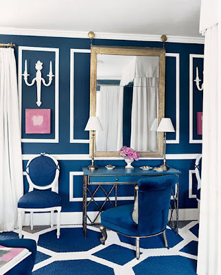
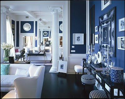
I love pink, navy and bold fun colors and patterns. Therefore, my idea of Chic Coles as a room is the fun and bright room from Domino as well as the living room done by David Lawrence.

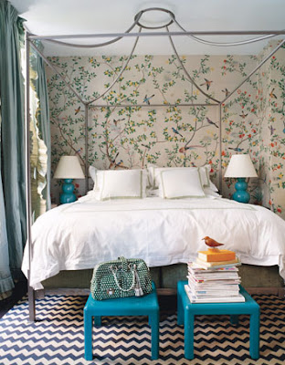
Anything by Massuco Warner Miller or Martha Angus is to die for! I love their work and these spaces in San Francisco are no exceptions. Turquoises, pinks and emerald greens are my favorites!
 
The color navy is our go to color so of course we use it in and on our blog. These rooms have the color navy in them so they represent our blog. The splash of pink we use adds just the right amount of fun. We always like to add peony’s or pink tulips to an interior. Grey is such a nice compliment to the navy and pink colors of our blog as well.

Thank you again, Amber for having us and we would love for you to come visit us at Chic Coles!

Thanks for being here, ladies! The rooms are gorgeous and very fitting of your blog! I love all of the beautiful graphic prints. Definitely stop by and check out their stylish blog.

Purple Power

May 11, 2011 by Amber Filed Under: Uncategorized


When thinking about the color choices in our home, I realized there is one color that I hardly ever use… purple! It’s not that I dislike the color, because shades of purple are actually very gorgeous in design. If I end up incorporating this color into our home, I think I am more drawn to the deep, dark hues of purple. I recently came across some beautiful rooms where purple is used. It might be in subtle ways or the main color- either way, it can be striking!

via
via
via
What are your thoughts on purple in design? In small or large doses? For me, I think I prefer dark hues of purple, in subtle ways!
Please check back on Thursday, as I will continue the If My Blog Was A Room series with a wonderful blog!! 

Settee Love

May 9, 2011 by Amber Filed Under: Uncategorized


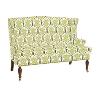
I love the look of mixed seating at a dining table. Using a combination of chairs, benches and settees always gives the space a unique, designed over time look. I love the use of upholstered seating at a dining space, whether it’s a pair of wing back chairs at the ends of the table, or a settee pulled up to the side- those spaces always seem to catch my eye. I have recently come across some gorgeous settees, I would love to share with you today!

All images via Ballard Designs. These settees are gorgeous and would look great pulled up to a dining table! Do you like the idea of mixing up the seating?

Happy Mother’s Day to all of you wonderful moms, especially my own!

The Details of This Design

May 5, 2011 by Amber Filed Under: Uncategorized


I am always amazed at the power of fabric when it comes to transforming the look of a design. I wrote a post here that showed 2 versions of a masculine chic design and asked your opinion on your favorite. You overwhelmingly voted for design #1, which I have to also agree is my favorite! I also liked some of your ideas about combining the two designs, blending some of #1 and #2 together. When I wrote the post, I said I would get into further detail about the room and design later. Well, here it is! I designed this space for my brother, who will be soon moving into a new place and starting with a blank canvas when it comes to the living room. He hasn’t decided on a place yet, so the amount of furniture and scale was only a guess. I do know that he likes neutral colors, mid century modern design and doesn’t prefer overstuffed furniture. He loved the two design boards I came up with and would probably go for a mix of the two designs! Here are the two designs I originally came up with:

Masculine Chic #1
Masculine Chic #2


  And here is a combination of the two, that might best describe his style:

Masculine Chic #3

This design is a blend of the two, with one exception: I found this new entertainment stand that fits the modern, mid century style a bit better. This was so fun to create, and I can’t wait to see the house come together! I have to say, that this might also be my favorite version of the design and probably best fits my brother’s style! (To see the sources for this design, go here.)

If My Blog Was A Room – Next Up – Name 5 Things

May 4, 2011 by Amber Filed Under: Uncategorized


It’s Wednesday and time for the series If My Blog Was A Room… where I pose the challenge to think of your blog as an actual space! What would it look like? I am so excited to have Emily here from her wonderful blog, Name 5 Things. Emily has a beautiful home and style, and I’m so happy to have met her through blogging! Here is her stylish blog header:

And here is what she came up with! Take it away, Emily-

I was excited when Amber asked me to be a part of her great “If My Blog Was a Room” series.  It was so fun to consider what my blog would look like if it was an actual room.


First, the room would have to be welcoming.  Someplace that’s put together, but not at all stuffy — someplace that’s comfortable and that you can kick your shoes off and stay a while.  

The room would also have to have at least some gray in it.  I’ve recently found myself loving all things gray — blog background, clothes, shoes, rugs, and paint color (heck, even my car is gray!).  

And of course the room would also have to be a little on the fun side too!  

(photo: the zhush)

(all photos: decorpad unless otherwise noted)

Frankly, I’m not sure if that’s what my blog is, or what I would ultimately like for it to be!  But regardless, it certainly was fun to think about!  Thanks for having me, Amber!

Thanks so much for being here today, Emily! Your blog is definitely like these rooms- elegant, fun and inspiring! I will have to bookmark all of these amazing images. If you haven’t already, stop by and check out Emily’s blog– you’ll be so happy you did!  

Layla Grayce Design Challenge

May 2, 2011 by Amber Filed Under: Uncategorized


I just can’t get enough of Olioboard’s design challenges, so I’m at it again! This time, the challenge is to create a master bedroom design using furniture and accessories from the elegant, coastal inspired Layla and Grayce. And the top three designs win a very nice gift card to use in their store! Yay- why not?!? A while back, I wrote a post here, where I created a design board using only one store- it can be done! With this design, most of the furniture and accessories are from Layla and Grayce. I named this design Layla and Grayce Style:

For this olioboard challenge, there are so many great design boards out there! To vote for this design, go here! The gray sphere design on the top left of the board is the wallpaper for the space. And the yellow bird fabric is for the drapes. The rest of the design is all from the wonderful Layla and Grayce or Burke Decor. To see the entire source list for the design, visit here.

Master Bedroom E – Design Details

April 29, 2011 by Amber Filed Under: Uncategorized


I was thrilled and excited when Marci from Timber and Lace asked me to guest post and create a design for her master bedroom! I knew this would be a fun project, because she already has great design ideas and is a very crafty DIYer. Here is what she was looking for in this space: drapes, upholstered headboard, bedside lamps, and add a small seating area. Marci’s style is modern and rustic. She was looking for upholstered pieces to help balance the wood and also wanted to work in yellow and gray for textiles. She already has a great starting point for the wall color, which is a dark brown/gray. Her flooring in this space is a light gray/brown short shag rug. So, here goes- here is the design I came up with! 

I knew Marcy wanted to keep the same design aesthetic here, as in the rest of the house. I tried to do that by bringing in natural elements, pairing wood pieces with neutral fabrics and keeping the overall design modern and rustic. Starting with the bottom left and working clockwise, here is a break down of the ideas behind the choices and shopping sources:
1. The dark gray color on the bottom left is Marci’s room color now. It is Willow by Benjamin Moore. I love this color- it was a great jumping off point!
2. The gray/white stripe pillow and yellow ikat pillow are both from this etsy source here.
3. The next two pillows are from a source Marci loves and can be found here. She also plans to incorporate their bedding, when it becomes available.
4. The chosen drapery panels are from Pottery Barn. Marci has 9ft. ceilings in this space, and I would purchase these drapes in 108in. and hang the drapery rods up to the ceiling. That helps draw your eye up and takes advantage of the height in the room.
5. Since we’re on the topic of window treatments, I also chose the woven shades for a layering effect to add depth and texture. These are blackout lined, for mornings when you want to sleep in and can be found here.
6. The starburst mirror will hang above the bed and is from Wisteria.
7. The upholstered headboard adds a soft element and is from Pottery Barn.
8. The table lamps can be placed on end tables next to the bed. Marci can either choose one design, or use one of each. They are both from West Elm. She already has end tables and an armoire that she plans to stain a gray color, which will work great in the space!
9. The leather cube ottoman from Ballard Designs can sit at the foot of the bed and Marci can use two to give the effect of a bench. It will help to visually add more depth to the headboard. The woven basket is from West Elm and will be great for blanket throws and books.
10. The bedding is from Dwell Studio and adds a sense of whimsical nature to the space. Marci has a bird statue on her dining table, so I thought this tied the two spaces together.
11. The armchair and side table are both from West Elm. I would add two of these armchairs to the space and place the side table in between. I chose the headboard and armchairs in a light fabric, to help balance the darker colors in the space. 
12. The wood accessory is also from West Elm and adds a rustic touch to the space.
13. The gallery wall is from Pottery Barn and gives Marci a place to add family photos or this Love art piece from this etsy source here.
14. Last but not least, is an idea I have for the main wall where the bed will go- this is actually a stencil Marci can apply to the one wall behind the bed. It will act as the focal wall and mimic the look of expensive wallpaper. (Marci’s beautiful craft closet is proof that she can stencil!) This stencil art can be found at this amazing etsy shop here. At first, I was going to suggest grass cloth for this wall, but when I found this, I thought it would be great! Marci can apply the stencil to her existing wall color and get a designer look without the expensive price tag! She can use a lighter shade of the wall color for a subtle touch, or a creamy white (like in the above design) for a more dramatic effect.  

Now that we’ve discussed the design in more detail, I can also show you my inspiration for this space, as well as Marci’s! After she described her style and what she wanted to achieve for this room, I found inspiration in this design:

This room has a lot of natural elements, and I instantly loved the bedding! Designed by Linda Woodrum for the HGTV Green Home 2011.

Marci already has an armoire and side tables that she plans to refinish in this gray stain color:

This was an inspiration photo Marci sent, and I love the stain color from this piece!

Here is a wonderful inspiration pic from Marci that shows her modern rustic style. http://www.archinspire.com/

There you have it- the story behind this design! I truly enjoy interior design and thanks so much to Marci for this opportunity! And she loved the design- yeah!!

If you would like some design ideas for a room in your home, please e-mail me at [email protected]. I would love to work with you!

Guest Post Today at Timber and Lace

April 28, 2011 by Amber Filed Under: Uncategorized


Today, I’m doing a guest post over at Marci’s blog, Timber and Lace. Her blog has amazing DIY projects and beautiful design ideas. Marci has given me an exciting challenge- to create a master bedroom design! I’m honored and thrilled to be asked! Stop on over here and check it out.

I will be sharing some of the design details on my blog tomorrow, including Marci’s inspiration pictures and my own! Thanks again for the opportunity, Marci!

  • « Previous Page
  • 1
  • …
  • 60
  • 61
  • 62
  • 63
  • 64
  • …
  • 69
  • Next Page »
Welcome!

Hi, I'm Amber... a wife, mom and interior decorator. I am the writer of Simple Dwellings and the designer behind Amber B Design. Blog topics are all things design, with the occasional DIY attempt! Thanks for stopping by Read more...

  • Bloglovin
  • Email
  • Instagram
  • Pinterest
  • Twitter

Blog Posts, Straight to Your Inbox

Popular Projects

A dining room with white walls and wooden table.
A black door with white curtains and a red chair
A staircase with black and white chevron pattern on the steps.

Blog Love

  • Addison’s Wonderland
  • A Thoughtful Place
  • Alison Giese Interiors
  • Amber Interiors
  • Bailey McCarthy
  • Caitlin Wilson
  • Chris Loves Julia
  • Classic Casual Home
  • Cottage and Vine
  • Design Indulgence
  • Dwell by Cheryl
  • Eddie Ross
  • Elements of Style
  • Emily A Clark
  • Emily Henderson
  • Gallery No Eight
  • Hi Sugarplum
  • House of Jade
  • Jana Bek
  • Juniper Home
  • Kate Marker Interiors
  • Lucy Williams
  • Monika Hibbs
  • Our Fifth House
  • Pencil and Paper Co
  • Rachel Parcell
  • Rambling Renovators
  • Pure Style Home
  • Sita Montgomery
  • Studio Mcgee
  • The Makerista
  • The White Buffalo Styling Co
  • the Zhush
  • Traci Zeller
  • Young House Love

Copyright Amber B Design © 2025 ยท Design by Britt Douglas