I was recently discussing this topic with a client for her gallery walls in her living room. In her space, we will be adding a couple of art/photo collections on her walls and I suggested to mix it up with different frames for a collected look. I thought it would be a great topic to bring up here on the blog, because I feel there are times when matching frames are necessary and other times when mixing it up is just right!
When to Mix Up Your Frames
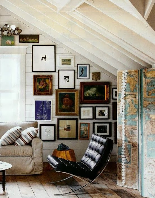
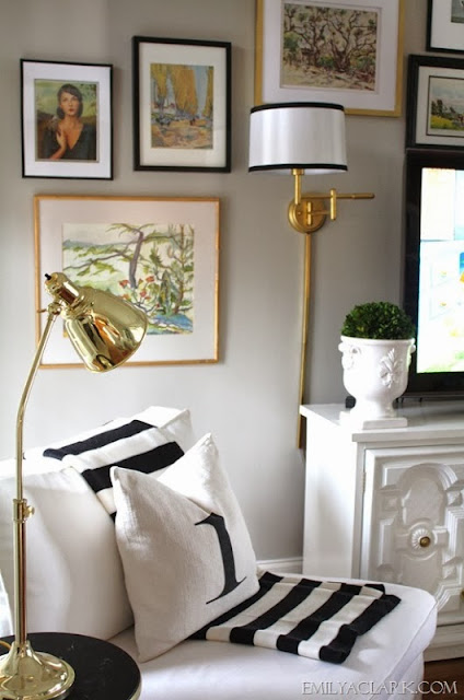
When you have an eclectic space and you are trying to fill it with art in an asymmetrical way, mismatched frames are great! Or like the last above image, filling a corner wall with framed pieces looks great when the frames are mismatched.
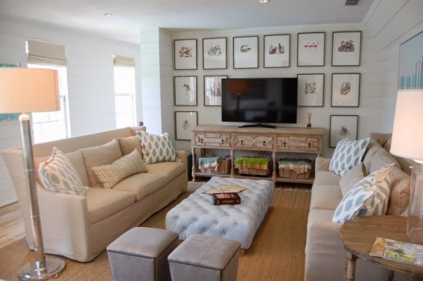
When art is hung around a television in an asymmetrical way, mismatched frames are great! For my client, this is what we’re going to try and I can’t wait to see the result! There are also times, however, when I think matching frames are necessary. For this client, for example, we are also working with matching frames in another collection in the space.
When to Match Your Frames
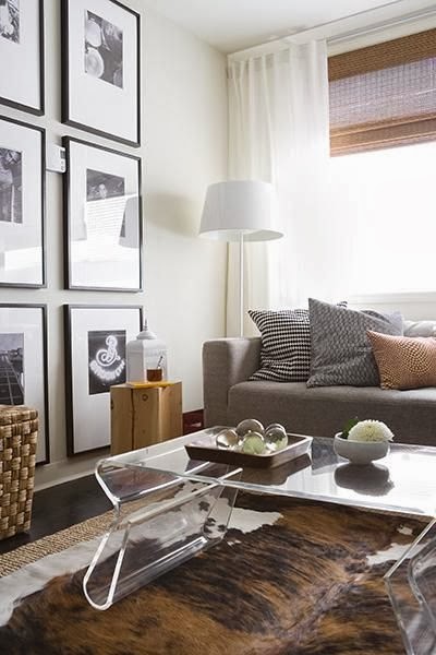
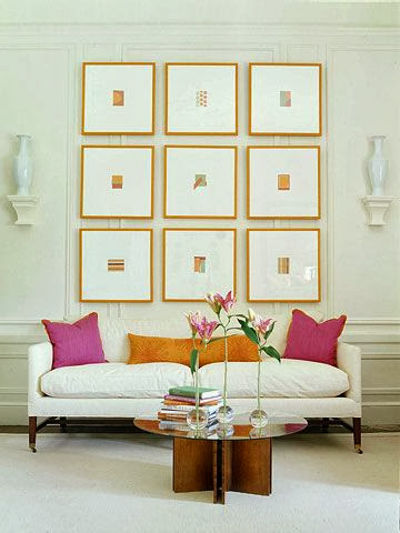
Matching frames are key when you are doing a symmetrical wall arrangement and would like a clean, simple look to your wall. A collection of similar photos and scale, like the gallery wall directly above, gives continuity to the art.
I mentioned earlier that we will doing a mixture of matching and mismatching frame collections in my client’s living room. I also feel it’s important to blend the two in one space, as opposed to having every arrangement symmetrical or every arrangement with the same frame finish. We will be doing a symmetrical gallery wall of family photos, that will be hung in a grid like pattern. For this, we will be using the same frame to bring a neat, orderly look to the arrangement. When there is a blend of the two styles, it makes the space unique and personal!
So that’s what is on my mind this Monday morning!
How about you… do you like to match or mismatch your frames? Are you a symmetry person or like a little asymmetry when hanging art?? Do tell!!


Great tips Amber. Most of ours are matching, but that is because the "theme" of the prints are. And, since the majority are in our upstairs hallway I wanted to keep the look clean.
I love your inspiration and your guidelines on hanging art and mixing it up!!!! I am all about mixing art and frames! Happy week to you!
Great tips! I love gallery walls, this post is so full of inspirations!
Lauren,
http://www.atouchofsoutherngrace.com/
Love your post Amber! This is interesting to me because I am doing a gallery wall in my family room and am trying to balance out the space with different frames because it would cost a fortune to do everything in the custom walnut frame of the one true art piece I have there. But it can be a little tricky to get it right and I'm worried about black ikea frames working with the expensive walnut one, lol. However, it's a welcome relief from all the white ones I used to have up.