I may have said this before, but I can be very indecisive when it comes to the decor of my own home. When working with clients, it’s easy for me to choose what I think is right for the space. My own spaces, on the other hand, can be a different story. Maybe it’s because I over think too much, when I should just go with my gut feeling. Maybe it’s because I will look at it everyday, so I better make sure it’s an investment worth having. Either way, I need your advice! We are back on the topic of the art above my sofa that I talked about here. I think I am looking for a hint of nature and one large piece, as opposed to a grouping of art. I love gallery walls as much as the next person, but I just took down our massive gallery wall and want a change. I am thinking about art that is at least 30×40 insize, which can get expensive. The below options, however, are very reasonably priced! To recap the space we are working with, here’s the massive empty wall that is begging for some art…
The Empty Wall
Here are some of the options, in no particular order…
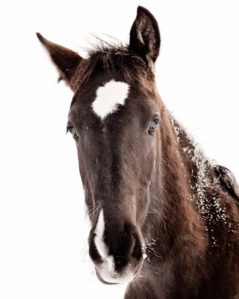
Option 1- Equestrian Art


I have always loved horses and used to ride too. So I couldn't even pick a favorite. They are all gorgeous and I'm sure would all look great above your sofa.
I think option 4 would be stunning. I've always liked horse prints.
I too am leaning toward the lighter versions, like 4 more because it is horizontal. Balances out the darker sofa and trim on the lamps. My daughter would be petrified…she has the awful fear of horses!! LOL
I vote for option 2! Great mix of equestrian and snowiness 🙂
I like 1, 6, and 4. I would be careful with the brown of the couch and the color of the wall either clashing or washing a picture out.
4 would be great framed. 1 brings in a little coral/red like your pillows. And 6 is very bold.
#1 – must have been your first instinct. If so, go with it – it is lovely.
Amber, if you're keeping the walls light, I would go with something that has a bit of darkness so that it pops off the wall and doesn't fall flat. If you feel something horizontal would work best then I would choose #2. He's a beauty!. For veritcal – #6 is stunning. Can't wait to hear what you decide!!
I love 5!
If it's above the sofa, I would pick something horizontal. I really like #4 on its own but it might look a bit washed out against your light-colored walls? No.2 still looks light with a bit of contrast to your walls, so that will be my pick. Hope it helps!
Jessie
http://www.mixandchic.com
I vote #1, I think a little contrast the light wall is good!
I love the look of #2…and the darker colors would look beautiful on your light wall…good luck!
My boyfriend likes option 1 and I love option 2.
#6!!!
I think #1 will go nicely with your brown couch (and it's a snow picture to boot!), although I am partial to #5 as well. There's just something about that horse's expression that I love. Plus the contrast between the light and dark shading makes it very interesting to look at.
I appreciate you and hopping for some more informative posts. Thank you for sharing great information to us. Free Art Classes Online