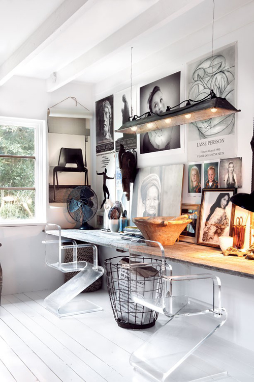
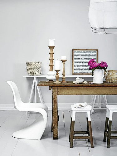
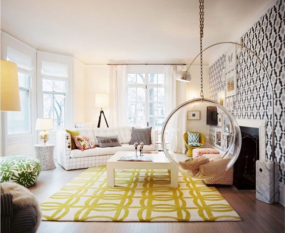
And here is what she came up with. Take it away, Kimberly!
If my blog was a room…. IF my blog was a room?! This question has been really fun to think about. I feel like my blog actually does a pretty good job of representing my design taste — a litte bit of eclectic, a dash of rustic, and a lot of contemporary color! Since starting this blog, I’ve definitely seen it evolve. I’ve come to realize my taste through the daily posts of inspiration I share, the DIY projects I attempt, and in the pieces I chose for our home. It’ll never stop changing {that’s for sure}, but for here and now this is what my blog would fashion if it had walls!
eclectic: when every single piece has a purpose. a hard look to achieve {ironically}.
Thanks so much for being here, Kimberly! The images she chose are gorgeous and remind me very much of her chic blog. I love the mix of design styles and taking it up a notch with fun color! Stop by Kimberly’s blog for some great design inspiration. And head on over there right now to enter her fabulous fall wreath giveaway with Nu and Boo. Enter HERE!


