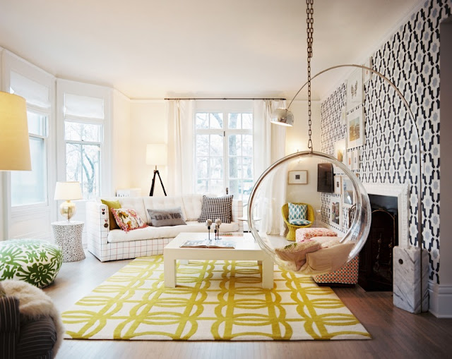
I am starting a new series called, Why This Works. Every Friday, I will highlight a beautiful space and talk about why (I think) it’s perfection! Maybe the colors are intriguing, the style is unique or the room’s design just works so well! I am kicking off the series with a beautiful living room from the wonderful Lonny magazine.
The interior design is by Lisa Sherry shown in Lonny. I think this room works because it is fun, whimsical and doesn’t take itself too seriously. I love the use of color in the bold patterned rug and seating. The circular seating mounted from the ceiling is modern and different, and it works so well paired with traditional style drapery and simple sofa. The designer uses one focal wall with the gorgeous print wallpaper, then juxtaposes that with a creamy white on the rest of the walls. The very modern, arched task floor lamp looks great paired with the traditional tripod base lamp. The graphic pattern and bold colors are there, but the designer shows great restraint in how she uses them.
In my opinion, this space works! What are your thoughts?
