I love their style already! And here is what they came up with. Take it away, Ladies!
Thank you so much to Amber for having us participate in the series “If Your Blog Were a Room!” While some people may have to think long and hard about images and inspiration they would use if they were a part of the series, it was different for us. Since we recently had a complete blog redesign, the four of us Coles were sending each other room images and inspiration as to the colors and fonts we wanted to use in our blog. We would send rooms and headers, color combinations and more. We took a couple of images and colors, patterns and fonts and combined them together in the blog re-design. Our blog as a whole and the images we post about reflect each of our individual styles. So therefore we are going to include multiple images think our blog would be like if it were a room!
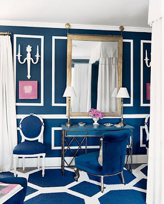
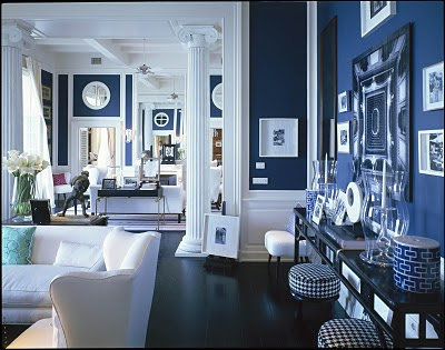
I love pink, navy and bold fun colors and patterns. Therefore, my idea of Chic Coles as a room is the fun and bright room from Domino as well as the living room done by David Lawrence.
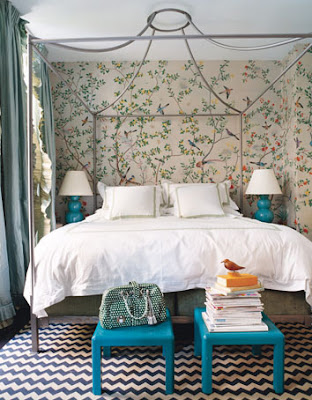
Anything by Massuco Warner Miller or Martha Angus is to die for! I love their work and these spaces in San Francisco are no exceptions. Turquoises, pinks and emerald greens are my favorites!
The color navy is our go to color so of course we use it in and on our blog. These rooms have the color navy in them so they represent our blog. The splash of pink we use adds just the right amount of fun. We always like to add peony’s or pink tulips to an interior. Grey is such a nice compliment to the navy and pink colors of our blog as well.
Thank you again, Amber for having us and we would love for you to come visit us at Chic Coles!
Thanks for being here, ladies! The rooms are gorgeous and very fitting of your blog! I love all of the beautiful graphic prints. Definitely stop by and check out their stylish blog.


Room looks cool and chic. Nice colors too. Painters Kitchener have these in their stock too.